I use cobalt violet as the underpainting for my paintings, an incredible trick I learned from Stapleton Kearns. I like to use it because cobalt violet is vibrant, making a painting shine from the first layer outwards and also because of its weak tinting strength meaning it won't dramatically affect any colors I put on top of it. In search of "the right paint", I prefer to try a different brand every time a tube runs out. Over time, I’ll find a brand I really like and stick with that. Due to personal taste I stopped using Gamblin's cobalt violet, and I’d recently finished a tube of Windsor & Newton's cobalt violet, so imagine my surprise when I bought a tube of Rembrandt cobalt violet only to find it was nearly a different color entirely:
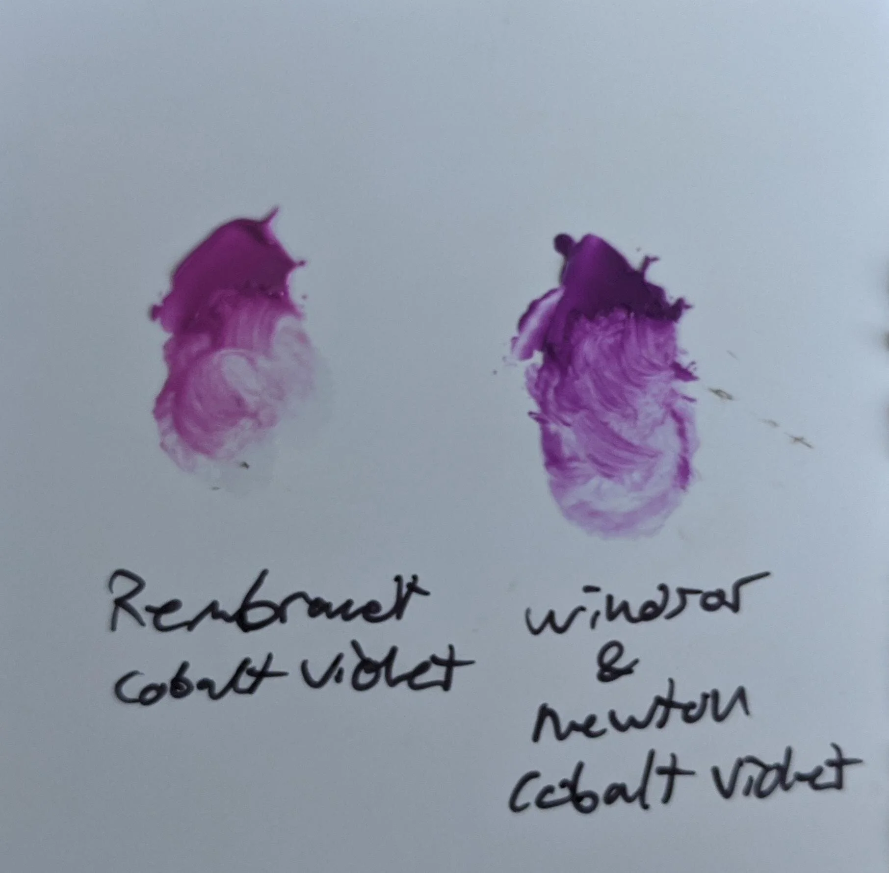
Two swatches of Cobalt Violet paint by different brands.
Both paint brands purport to sell the same product: Cobalt Violet. Both brands are labeled the same yet they are nearly different colors. Rembrandt's Violet is far more pink than W&N's, in fact it's far more pink than any other Cobalt Violet I've used up to this point. There is no way for me to know why this is different, as it's not included on the label, short of me directly writing to both companies to ask.
What's going on here?
In my time as a Blick worker, I often answered the same questions over and over again (as with all retail). I often fielded the paint questions because around this time I was also geeking out hardcore about making my own paint. People frequently wondered what the differences were and with at least 5 'artist-grade' paint brands to choose from and well more 'student-grade' to choose from the differences aren't always easy to spot. Many times, it takes buying and using a tube all the way up to find out.
There are several major differences between brands of premade paint. First, we should acknowledge that paint is comprised of three ingredients: pigment, vehicle, and additives. Of these, paint tubes usually only display the pigment and vehicle, and the really cheap ones don't tell you anything at all. We're going to focus on just the pigment.
There is a classification system for pigments, and like other classification systems there is a disconnect between the names of paints and the technical ingredients. For example, Naples Yellow is originally made from Antimony Yellow which was an 18th century replacement for Lead Tin Yellow. In part because of the toxicity and modern expense, Naples is now often made as a 'hue' using combinations of other colors. If you open up Naples Yellow from Grumbacher, you will discover a completely different color from Gamblin. From Grumbacher.chartpak.com, Grumbacher Pre-Tested Naples Yellow contains: Zinc Oxide (PW4), Cadmium Yellow (PY35), Cadmium Red (PR108), and Natural Brown Oxide (PBr7). Meanwhile on Dickblick.com, Gamblin Artist's Oil Color Naples Yellow contains Titanium White (PW06), Arylide Yellow (PY75), and Yellow Ochre (PY43). We'll return to the compound information in a second, but here is what both paints advertise as their color online:

Gamblin Naples Yellow (from their website)

Grumbacher Naples Yellow, From Their Website
They share not a single pigment in common, appear visibly different, and neither are true to the original formula yet they're both sold under the same name: Why? The answer is that “Naples Yellow” is an idea rather than a pigment. With colors like Naples Yellow, the difference between brands is so dramatic that for any artist's purpose, they may be considered different paints entirely. For Naples Yellow, the name is more of a general description and not a specific definition of a color.
For the far less dramatic differences, let’s consider paints that are defined by their name and remain generally consistent. If you look at the ingredients listed on a tube of paint, you’ll often be rewarded with pigment classifications, for example: titanium white (PW06). PW06 means Pigment White #6 and refers exclusively to titanium dioxide rutile. This classification system is mostly precise and refers to the chemical compound used as the pigment. Still, there are differences in pigment. Sourcing the pigments will often affect the final qualities.
Take the case of Pigment Blue #29 (PB29): Ultramarine Blue. Ultramarine Blue can be purchased in "green shade" and "red shade" which tint the final color warm or cool depending. For professional artists, this is a significant difference. Yet, the pigment classification makes no distinction between the two, it is up to the manufacturer to explain the difference (or not). In the case of ultramarine blue, most of the time it's warm shade unless stated otherwise.
So why is my new tube of cobalt violet pinker than every previous tube? Well, from a purely technical standpoint, both are classified as PV14 (pigment Violet #14) which means there's probably a sourcing difference. After that, additives, and oil choice usually won’t alter the colors so dramatically out of the tube.
A better clue comes from the finer brands. The more expensive (and usually better made) paint brands such as Williamsburg and Michael Harding. For example, on Michael Harding’s website, Two colors are displayed: Cobalt Violet Light and Cobalt Violet Dark. Thankfully, MH has done the fine research for us stating of Cobalt Violet Light:
“Inorganic – First made from the rare ore of Cobalt Phosphate in the mid-19th century, this is now a synthetic inorganic pigment, of which the lighter shade is closer to the original, natural version.
Incredible! It’s completely reshaped my understanding of modern cobalt. I used to treat this color like it was radioactive (because heavy metal poisoning is the opposite of fun). So a little research goes a long way. Thanks Mr. Harding! Additionally, I use several MH paints and I can attest to their fine quality. You’ll pay for it for sure, but it’s a far finer paint than other brands. Quality wise it’s in the running with Old Holland and I would estimate is superior to Williamsburg.
Case closed!